Redesign of Konbini’s website
For two weeks, I had the opportunity to work for the French news media Konbini France with a member of their product team.
Their main design problem is on the web site: they asked me to work on the home page to show off all the different categories and the sections of the website, which they brand as channels, to have a more classic news site look and feel.

Who is Konbini ?
Konbini is a pure-play online news media with a strong presence on all social media. They mostly target young people and often give the floor to speakers defending important causes.
Why is their social media presence essential?
Because our way of consuming content is evolving and now 87% of people go on social networks to keep up with the news.
Facebook is the first source of news for young people, and ⅓ of young people ranging from 20age to 30age follow the news on Instagram. Both social media benefit from the evolution of the format in which the news can be delivered: podcasts, videos, etc.
The new ways people consume the news explain why there are more and more 100% digital news companies such as Buzzfeed, Brut, Vice, Loopsider or Melty.
Very much like Konbini, these news companies heavily rely on social media to report on “youth culture” with videos and articles. And they often tackle sensitive subjects and causes through “gonzo journalism”, a method of journalistic investigation based on ultra-subjectivity.
But, the question is: in addition to consuming these news companies on social media, do users also directly visit these companies’ web sites to get more news?
To get answer to that very question, I did primary research with 60 people I recruited myself.
Unfortunately, 60% of the participants answered No; they don’t go to the web sites of these news companies to have more information.
And it’s the same issue for Konbini because only 5% of their users go to the site with a bounce rate of 88% according to Konbini’s data from Google analytics.
To know why, I conducted some interviews to better understand their motivations and create a representative user flow.
The reason why they don’t go to the Konbini website is that the content published on their social networks is enough for 60% of them.
Here’s how their user journey goes
They may or may not be following Konbini on social media, they see an article or a video they are interested in, they click to read or watch without necessarily realizing they have been redirected onto the Konbini web site, and once they have finished consuming the content, they directly return to their social media app.
“Seeing Konbini on social media makes you forget that there is a actually site altogether… So, I often look at their content on social media, and I never thought of going to their website for information”. Alexandre, 24yo, Konbini’s users.
When users go on Konbini.com, do they find information easily?
And, it’s a no for 75% of the participants; users don’t find information easily on the site.
The main pain-points are:
- Feeling forced to read certain content.
- Information overload.
- Expecting it to be more “user friendly”.
- The web site being less attractive than their social media.
But the biggest pain-points is a significant misunderstanding on the burger menu between subjects and channels.

To fully understand that, I made a site map of their existing web site, and I seen a lot of inconsistencies that confuse users.
We have a very interesting insight about it from a user :
“I would like to go straight to the point without having to search, but the sections are not visible on the home page, and I don’t understand them in the burger menu. “ Clara, 25yo
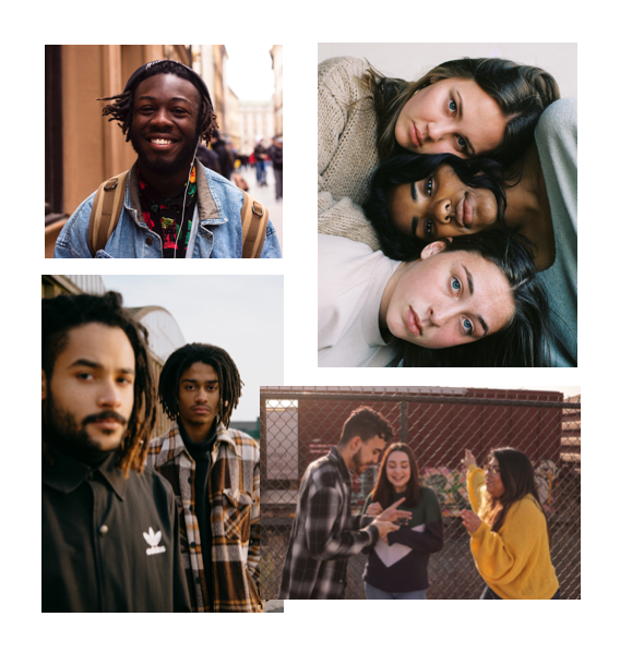
With all my research, we can better understand Konbini’s users: they are digital natives, between 15 and 25 years old.
They represent a generation that is actively conscious of different issues at much younger age than their parents were. And they are not afraid to express their dissatisfaction to change the way people think and act because they know they have some of the keys of the future in their hands.
“For them, the notion of the media being an institution disappears. Each content is worth its weight in gold. It is, therefore, necessary to question, to put forward a conversation or even to shock for it to be seen.” Jean-Marie Charon, media sociologist.
Like they say “Information is everywhere, no need to go looking for it, it comes to us.”
So, what do they need?
Konbini’s users need a straightforward and quick way to access information without searching to have a global vision of the various recent content they’re interested in.
Because they hate feeling stuck and lost on a site and the feeling of being forced to consume content they don’t want to.
Ideation
After some Crazy-8 ideation sessions, I prioritized functionalities with the Moscow method.
What are the Must-have functionalities?
- Feature a single top story.
- Include a selection of recent news.
- Make news easily scannable.
- Organize news by category.
- Show consolidated menu.
- Make search visible & prominent.
- Display clear category title at the top.
- Highlight the top stories related to the category.
- Add social share options.
- Allow user to switch easily between sub-categories.
What are the Should have functionalities?
- Ensure links are easily identifiable.
- Add estimated reading time.
- Encourage to continue reading.
What are the Won’t have functionalities?
Solution
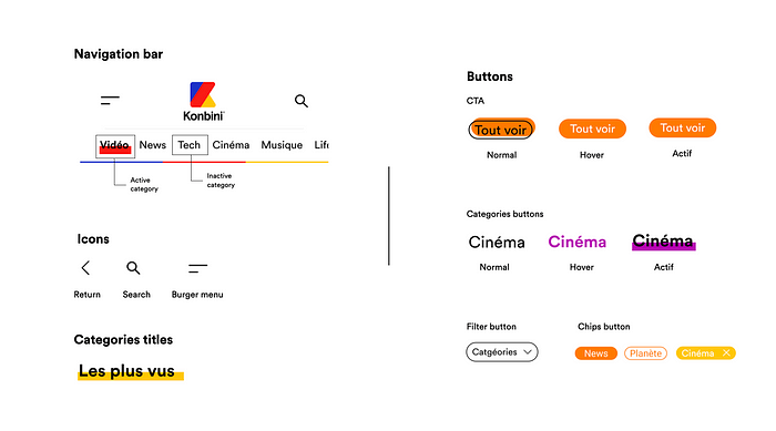
The solution is to design the home page with a horizontal navigation menu bar to avoid the use of a burger menu and also simplify the difference between “ channels “ and “ subjects “.
In addition to that, I wanted to make sure to design mobile-first because Konbini is a news company on social media and 95% of the users consume their content on mobile. Then I would design a desktop version and show it to Konbini to explain to them how I thought the website would work for both devices.
Here’s how the existing web site looks:
Before designing the mid-fi wireframes, I made a list, with Konbini, of heir technical constraints :
- They want to put “web stories” linked with Google who are vertical.
- The format of the videos must imperatively be horizontal because they are embedded Youtube videos.
- They want to keep all channels and subjects’ names as-is.
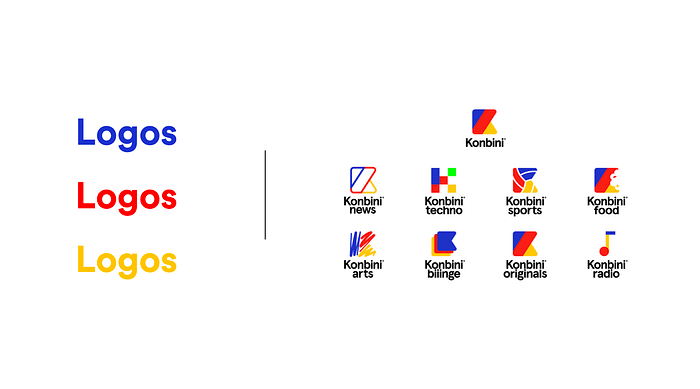
- Each channel has its own logo.
I designed two versions of mid-fi :
1st version: an overview of the last three articles of each category with no carousel.
2nd version: the four more recent articles in a horizontal way with a carousel.
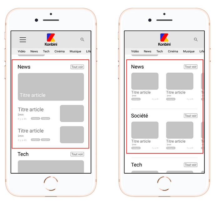
I tested those two versions on seven users, and all of them choose the second versions with the carousel:
“There is already a lot of information on the home page, it’s easier with a carousel to scan it. We are used to scrolling on mobile phones.” Anne, 26 yo.
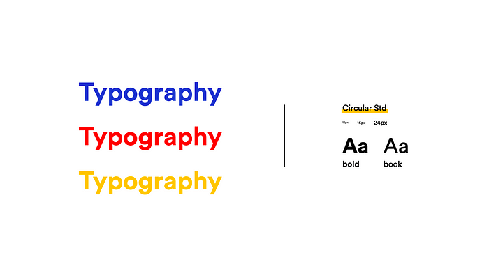
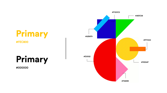
After that, I focused on the Konbini DNA and I made a style guide with their typography, logos, colors, and the graphical elements for the hi-fi prototype.

Mobile version
Now we have all the categories and channels together and fixed on the top. It’s now easier to scan all their categories, which allows me to avoid use the burger menu.
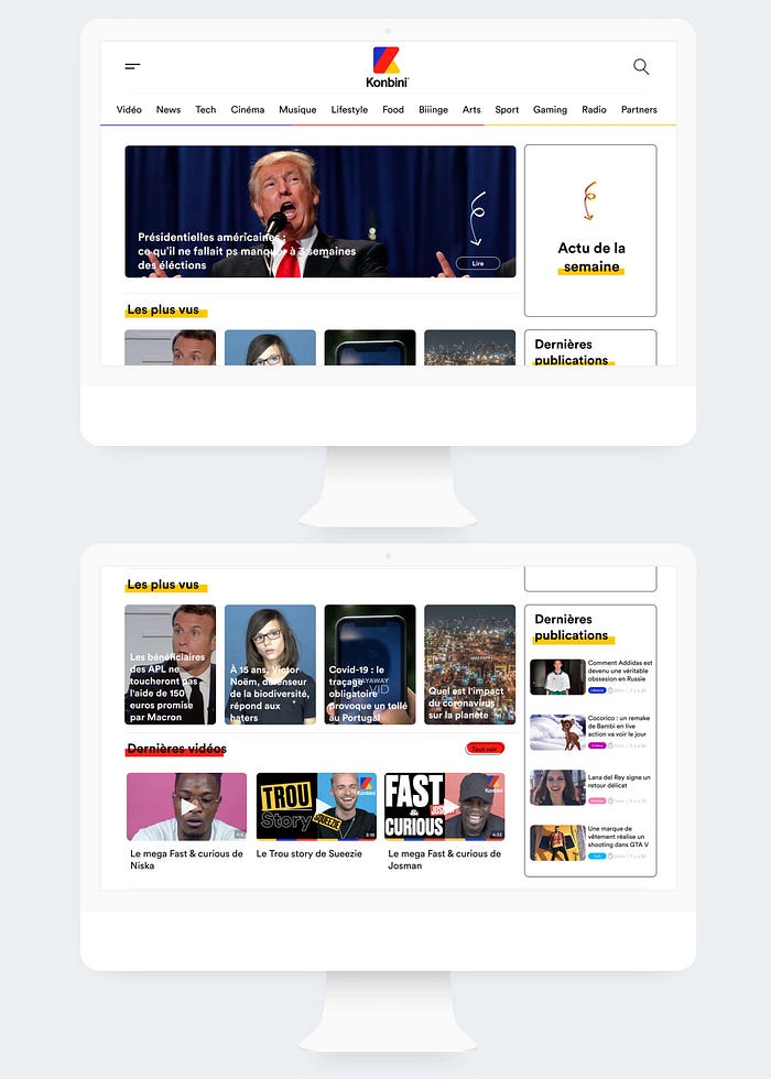
At the top of the page, we have the “breaking news” and then the “most viewed” contents with their “web stories”.
Videos are the first category appearing on the homepage because users know and follow Konbini for that.
For all the categories, there are now the reading time, and a color tag to help differentiate each category. There is also a carousel of the last four articles of each of Konbini’s categories.
I have used the exact same home page template for all channels, but the logos and the sub-categories bar design changes to have a different universe visually.
On an article page, there are now :
- the main information at the top.
- the links to other articles on the same subject which are now highlighted.
- They want to keep all channels and subjects’ names as-is.
- Keywords about the article along with “the most viewed” and “the most liked” articles to suggest more contents.
I have used the same design for the video pages.
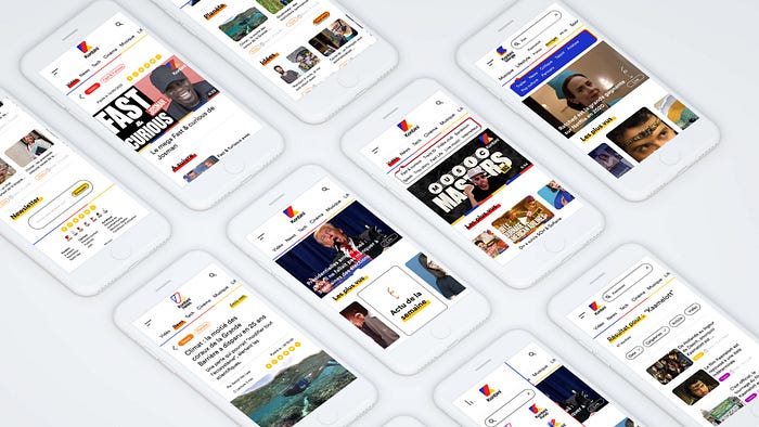
Desktop version
Result
I run a desirability test, and the keywords participants selected to describing their feeling about the screens are:
- Young
- Cool
- Dynamic
It is good news because they represents well Konbini’s values.
I have also done a second round of usability tests with seven users during which I got some exciting quotes like:
“I was expecting to see a site like this the first time I went to Konbini.com.” Estelle 25 yo
“It’s clearer, more understandable now. It looks more like a classic news web site while keeping Konbini’s pop DNA.” Margot, 23 yo
Now in terms of UX metrics, I believe we will know we have reached our goal if:
- Global traffic from search engines increases.
- Rate page/session increases.
- Bounce rate decreases.
What did I learn ?
In the end, I learned that without offering differentiating and engaging content on the Konbini web site, people will continue to not visit it.
Next steps
As working for Konbini was a rather quick project, here are the few things I would do with more time on my hands:
- I would add more white space between categories.
- I would increase the size of the logo on the footer
- I would create the pages for all the categories.
Thanks for you reading !
